"Loading..."

There's a difference between HYPE and HARDWARE.

There’s a difference between making claims and claiming titles.

We are part of one of the most successful athletic programs in the country. The number of schools with more NCAA team championships than Oklahoma State can be counted on one hand.

Our championships are not mythical. They are not hypothetical. What they are is numerous.

Records and achievements can grow fuzzy over time, which leads to documentation being less than it could be. However, we know Oklahoma State’s conference championship total is over 300.

Our hallways are walked by Olympians and national champions... by All-Americans and by household names.

The championship history here is real. The championship culture here is real. And the championship story is one that we all get to tell.

This guide isn’t just about establishing rules, it’s about giving you a toolkit to help tell that story.

You’ll learn about our logos and marks, and when and where to best use them. You’ll learn about the usage of colors and typography.

It’s important to understand that any messages we distribute represent our teams, our institution, our state and everyone that cherishes them.

It is why we have to get it right, and why this guide is here to help.

Ride For the Brand

When we talk about THE BRAND at Oklahoma State, we refer to both the OSU Brand logo that we proudly wear, but also what makes us proud to wear it.

While branding can start with logos, school colors and uniforms, it extends to the greater image that we want to portray about Oklahoma State at home, across the country and around the world.

To know what we're branding, we must first understand the core values of not just our athletic department, but our University as a whole.

The visual side of branding starts with the cornerstone of our identity: the new OSU Brand.

The new brand might look identical to the logos OSU has been using for the last several years, but there are actually several design tweaks intended to clean up inconsistencies that have been present since the 2001 redesign, as well as improving the integrity of the mark when reproduced to smaller sizes.

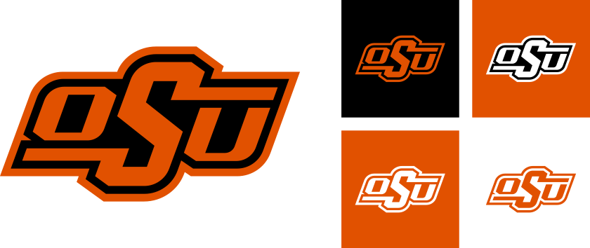
The new brand is simply two colors, orange and black. No lighter shades of orange or bevel effects or extra gray outlines are needed.

There is also now only one version of the brand, regardless of light or dark backgrounds. Additional colorways may be used to ensure the mark remains prominent on different backgrounds, but the overall design remains the same.

Additional tweaks range from fairly noticeable, like the thicker bars on the ‘S’, to the much more subtle, such as the horizontal shear angle of the mark being adjusted to 20 degrees.

While the updated brand isn’t the only logo for OSU Athletics, it should always be given top priority to ensure that it remains the primary mark associated with Oklahoma State University.

Remember that our logos are seen not just by ourselves and our fans, but will be seen by the rest of the nation and world.

OSU Brand History

The OSU Brand was originally introduced in the 1970s, and was meant to evoke the western heritage of Oklahoma and the “Cowboys” name by mimicking the design of a traditional cattle brand.

The brand made its first appearance on a football helmet in 1973 and has remained there ever since, although it has undergone some design changes over the decades.

But while the brand has been in constant use in OSU Athletics for almost 50 years now, it hasn’t always been the logo for Athletics.

During that time, the brand was joined by the Block O-State, Pistol Pete and the interlocking OS as logos that all represented OSU, but their use was consistently inconsistent. Fans and alumni could see any of these marks representing OSU from uniforms to merchandise to sportscasts on television.

OSU’s logos underwent a redesign in 2001 and the updated OSU Brand increasingly became the focal point of Athletics branding from that point forward.

The OSU Brand was updated again in 2019, but the most significant development is that the brand will now represent all of Oklahoma State University, not just its athletic department.

Two Color: The two-color mark rendered in orange and black is the most preferred version of the OSU Brand. It should be used wherever possible.

One Color: In instances where the two-color mark cannot be used, a one-color version is also available. We recommend using an orange brand on black backgrounds and a white on orange backgrounds.

Lowest Priority: While these versions of the brand are allowable, consider them the lowest priority in your usage.

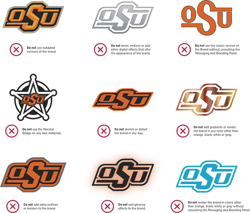
Only use the current version of the brand in its approved applications and lockups. Any questions regarding the modification of the brand or using expired marks for special events should be directed to the Messaging and Branding Panel and must be approved by the Director of Athletics or Deputy AD.

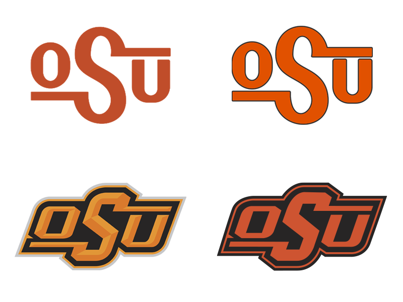
Do not use old or modified versions of the OSU Brand, like the examples above.

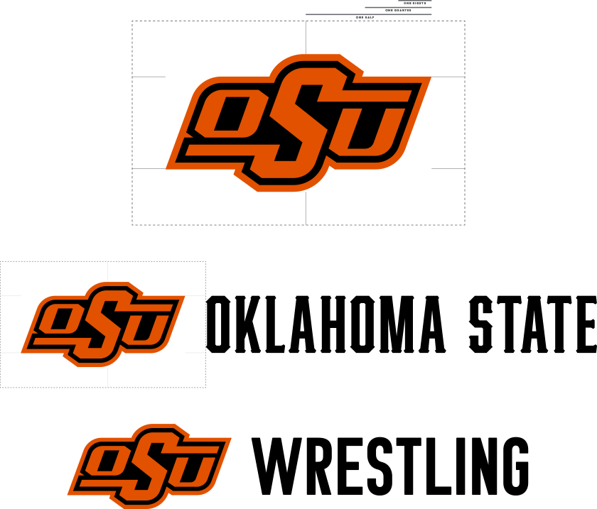
The OSU Brand should always be given plenty of breathing room so as to not get lost amongst other design elements. Maintain a distance of at least one-eighth the width of the OSU Brand around the entire perimeter of the brand in your designs.

The Oklahoma State, Cowboys and Cowgirls wordmarks or any large letterhead placed alongside the brand should not be equal to or exceeding the height of the brand. A good rule of thumb for the proportional height of wordmarks or letterhead next to the brand is the main horizontal body of the brand, as seen above.

SUPPORTING MARKS

Pistol Pete

Around 1923, when Oklahoma A&M College was searching for a new mascot to replace their tiger, a group of students saw Frank Eaton leading the Armistice Day Parade.
He was approached to see if he would be interested in being the model for the new mascot, and he agreed. A likeness of Eaton was drawn and a tradition was born.
Pete has been a part of our identity longer than OSU has been known as OSU.

PETE HEAD

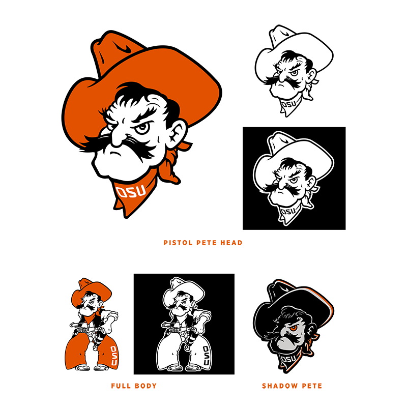
The Pistol Pete head should have the highest priority of all the Pete marks. The Pistol Pete marks should not be reversed and Pete’s eyes should always be directed toward the viewer.

FULL BODY

The full version of Pete is a step below the head because its complicated details and vertical nature do not scale as well at smaller sizes and lower resolutions.

SHADOW PETE

Shadow Pete, or "Phantom Pete," is allowable but should be considered the lowest priority of the main Pete marks. Shadow Pete should only be used in full-color applications.

CUSTOM PETES

Customized Petes for specific sports are permissible, but should be considered on the lowest tier of OSU’s athletic marks. Custom Petes can be used on graphics and team-issued apparel, but must be accompanied by the OSU Brand or the “Oklahoma State” wordmark or verbiage.


Wordmarks

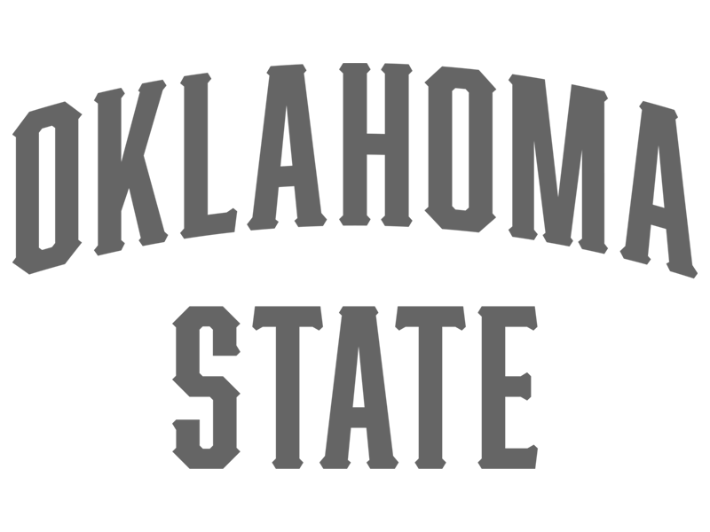
The new Oklahoma State, Cowboys and Cowgirls wordmarks were unveiled in summer 2019.

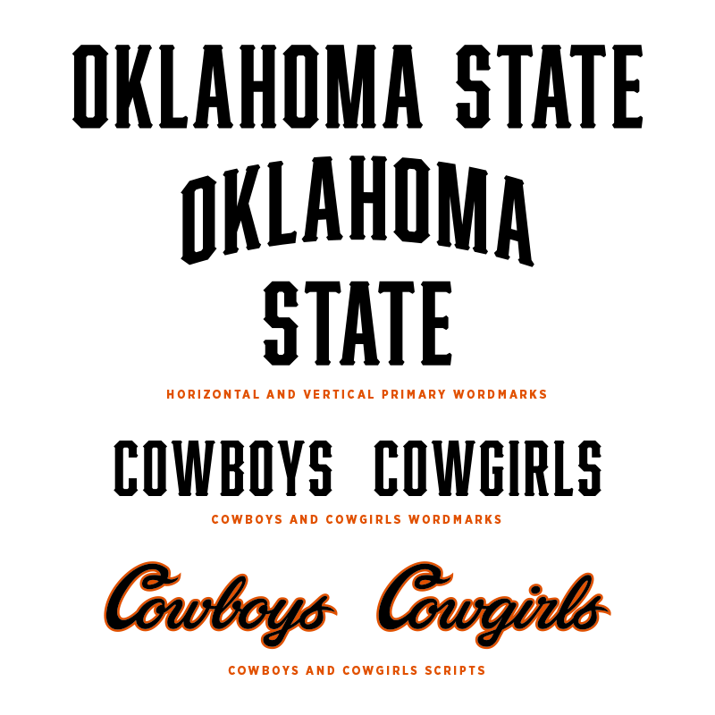
The Oklahoma State marks are available in both horizontal and vertical lockups. Be mindful of the space available when deciding whether to use the horizontal or vertical versions.

The appearance of the wordmarks should not be altered in any way without prior approval from the Messaging and Branding Panel.

Scripts

Accompanying our primary brand mark and wordmarks is a pair of official Cowboys and Cowgirls scripts.

The script marks are inspired by the men’s basketball team’s throwback uniforms of the late 1990s, with the addition of an all-new “Cowgirls” script to stand alongside a Cowboys script that has been updated to clean up inconsistencies found in the original.

The script Cowboys and Cowgirls marks can be used in all men’s and women’s sports in applications from social media to uniforms and facilities to add extra flourish for our teams.

COLORS

Orange and Black have been a core part of Oklahoma State’s identity from the very beginning. In fact, these school colors were the original foundation on which the rest of our identity was built.
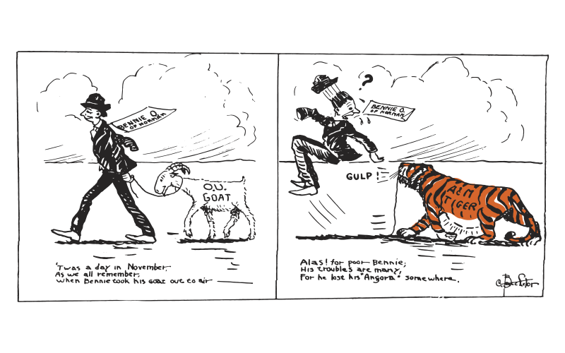
The selection of orange and black was a tribute to a popular faculty member whose father was a Princeton graduate. Students adopted Princeton’s orange and black colors and some of the school’s first athletic teams were even referred to as the Tigers in the early 1900s.

Though the Tigers mascot eventually gave way to the Aggies, Cowboys and Cowgirls, orange and black has endured from the 19th century into the 21st.
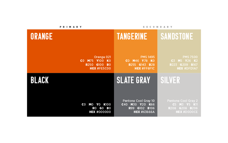
Secondary colors may be used as accents in marketing and social media materials, but should never supersede the primary color palette. Tangerine takes the place of PMS 151 in the old color palette, but should only be used in small doses. Sandstone is a new addition that mimics the trim in the signature modified Georgian architecture of the OSU campus. Sandstone should only be used as an accent.

Be mindful that these colors are only meant to support orange and black. Those are our school colors. Always have been, always will be.

COLOR VALUES

Color values are assigned based on where they are used in different mediums.

PMS (Pantone Matching System) values should be used only when a spot color is needed. This information is useful for some printers.

CMYK values are almost always used in print work, from media guides to posters.

If you’re working on a project in a program like Adobe Illustrator, you’re likely going to be dealing with CMYK. RGB and HEX values should be used when reproducing colors in digital environments, such as social media and video.
TYPOGRAPHY

Cimarron

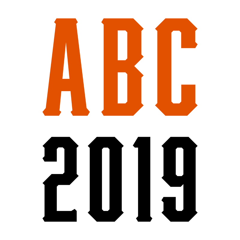
Cimarron is the new primary typeface of Oklahoma State Athletics. Cimarron was developed internally and replaces the “Go Pokes” typeface that was introduced in 2001.

Cimarron draws influence from both traditional collegiate block typefaces of the past, as well as our own western heritage, creating a style unique to OSU.

Cimarron should not be considered a font. It should be used sparingly and only on OSU Athletics-related materials so that it doesn’t become diluted or used in improper fashion. Limited usage of Cimarron outside of the Oklahoma State, Cowboys and Cowgirls wordmarks – for example, nameplates on uniforms or lockers – is permissible, but must be approved by our Messaging and Branding Panel.

Usage of Cimarron for numbers on team uniforms is encouraged.


Wordmark and Brand paired with Komu

Komu

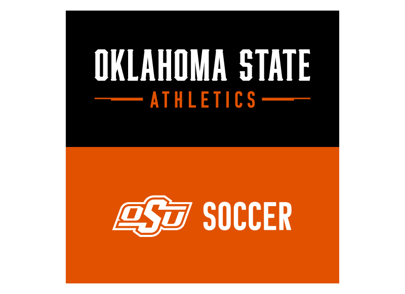
Komu B is a supporting typeface meant to stand alongside the brand, the wordmark and scripts.

Komu B does not have any lowercase characters, so it should be used to denote departments and sports in places like letterheads and facility signage, or as a large attention- grabbing headline in graphics. It should not be used for large bodies of text.

Komu B can be accessed through Adobe Fonts.

BEST USES Headlines, letterhead and signage

Gotham Narrow

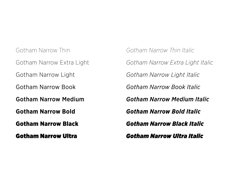
The Gotham Narrow font family is a versatile typeface with a variety of weights that can be used in several applications.

Gotham Narrow should be used when readability is most important with bodies of text, like press releases and media guides. The Book weight of Gotham Narrow is the preferred option for text bodies, with the medium, bold, black and ultra weights available for added emphasis. The light, extra light and thin weights can be used when the text is large enough to maintain legibility.

Licenses for Gotham Narrow may be obtained on campus by contacting the office of OSU Brand Management.

BEST USES Subheads and body text

GRAPHIC ELEMENTS

At Oklahoma State, we’re proud of who we are and what we represent. This is an institution that has a presence in all of Oklahoma’s 77 counties. We represent all of Oklahoma, and athletics is arguably the most visible representative of that mission across the nation and world.

The design elements in this section can help add flair to your designs, while staying consistent with the design language of the department and the spirit of OSU. Consistent use of all elements will help reinforce that all of our teams play for the same team.

Ribbon

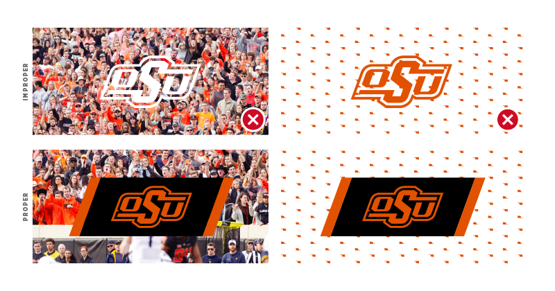
The OSU Brand should always be vibrant and visually distinct from the background. While using the different colorways shown earlier in the manual is an easy way to preserve the visual integrity of the brand on flat backgrounds, things start to get complicated when the brand is placed on top of more complex backgrounds, like photographs or patterns.

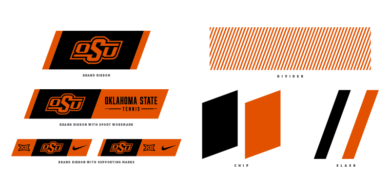
We created a "ribbon" to encapsulate the brand, which will give it breathing room from other objects, as well as protect it from any distracting imagery.

The ribbon container, detailed further in the marks section, has the same 20-degree shear as the OSU Brand logo itself. The ribbon can be extended to include other marks, including sport-specific wordmarks, the Big 12 Conference logo or even sponsor logos.

The 20-degree shear will be appearing regularly in other elements throughout this section.

Additional Elements

All the graphic element examples on this page share the same 20-degree shear angle present in the OSU Brand mark. This allows for combining multiple elements without any of them looking out of place - but remember that in many cases, keeping things simple goes far in making a more memorable and impactful message.

All of these elements can be scaled or rotated to fit any application.

If you've made it this far, thank you.

The Oklahoma State story is something we all deeply care for, and you're an important part of telling it. Please download the full version of the OSU Branding Guide for even more information on our visual identity.